
Background
After announcing her candidacy to take Utah’s 4th Congressional seat back for the GOP, Kathleen Anderson was ready for war, and she needed all the pieces on her side. The seat was hers to lose, but some changes had to be made at the state and local levels starting with a simple comms plan and straightforward political messaging that spoke plainly to voters in a non-condescending way.
Strategy
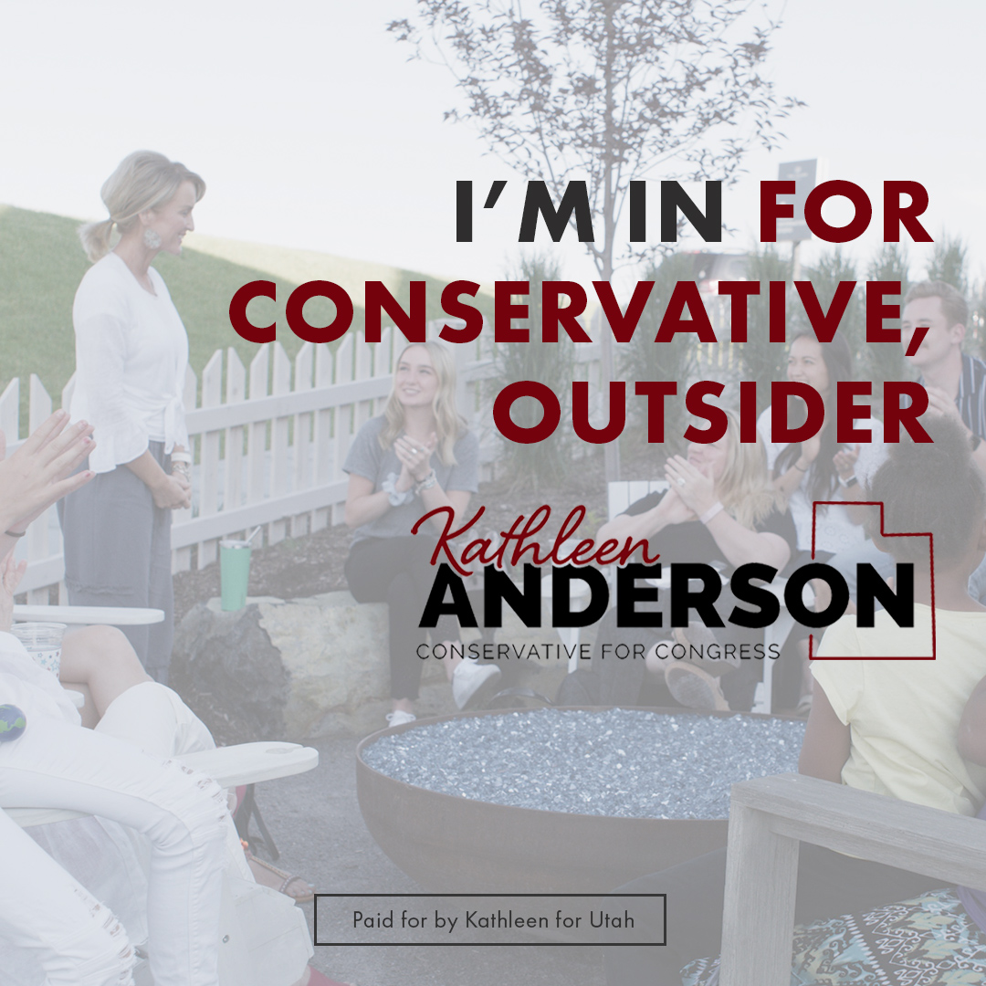
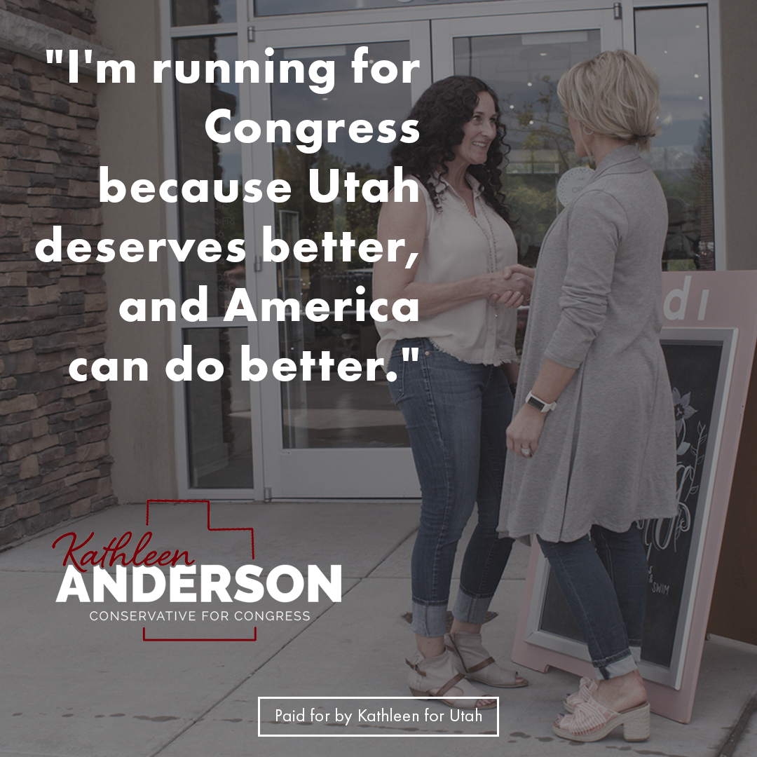
Use a modern, bold color scheme along with “strong”-looking font combinations balanced against subtly overlaid still-photography to help communicate Kathleen’s unwavering conservative values and friendly, approachable personality all at once.
Solution
A modern brand identity with carefully picked colors that subtly energize with a bold crimson color, and a minimalistic, understated white gradient that helps the beautiful still shots stand out and grab the users’ attention. The messaging that Kathleen is a strong conservative who will fight to bring back strong conservative values to Utah and the nation remains front and center throughout.
Services
- Graphic Design
- Digital Advertising
- Comms Planning
- Political Messaging
Client(s)
POOLHOUSE
Kathleen Anderson
Year
2019


