Background
Shortly after launching, The Shed, a RVA based rental start-up, needed some ideas to help them get through COVID-19. The 1st of which: Celebration Park. A 6,000 acre escape for weddings, corporate gatherings, music events, & more, where you can rent anything for, including different sized tents, flooring, fine china, DJ’s, tables/chairs, & much more to make your day perfect (despite the pandemic). This called for a simple, easy to use landing page design!
Strategy
We wanted to merge The Shed’s current brand standards with something a little more ‘refined’ & sophisticated to appeal to a larger, more professional audience interested in weddings & large gatherings. While the Celebration Park brand used the same colors & fonts as The Shed, it relied a lot more on blue than green to help sell the “sophistication” & professionalism. A script font in the logo led viewers to see it was a more serious side of The Shed.
Solution
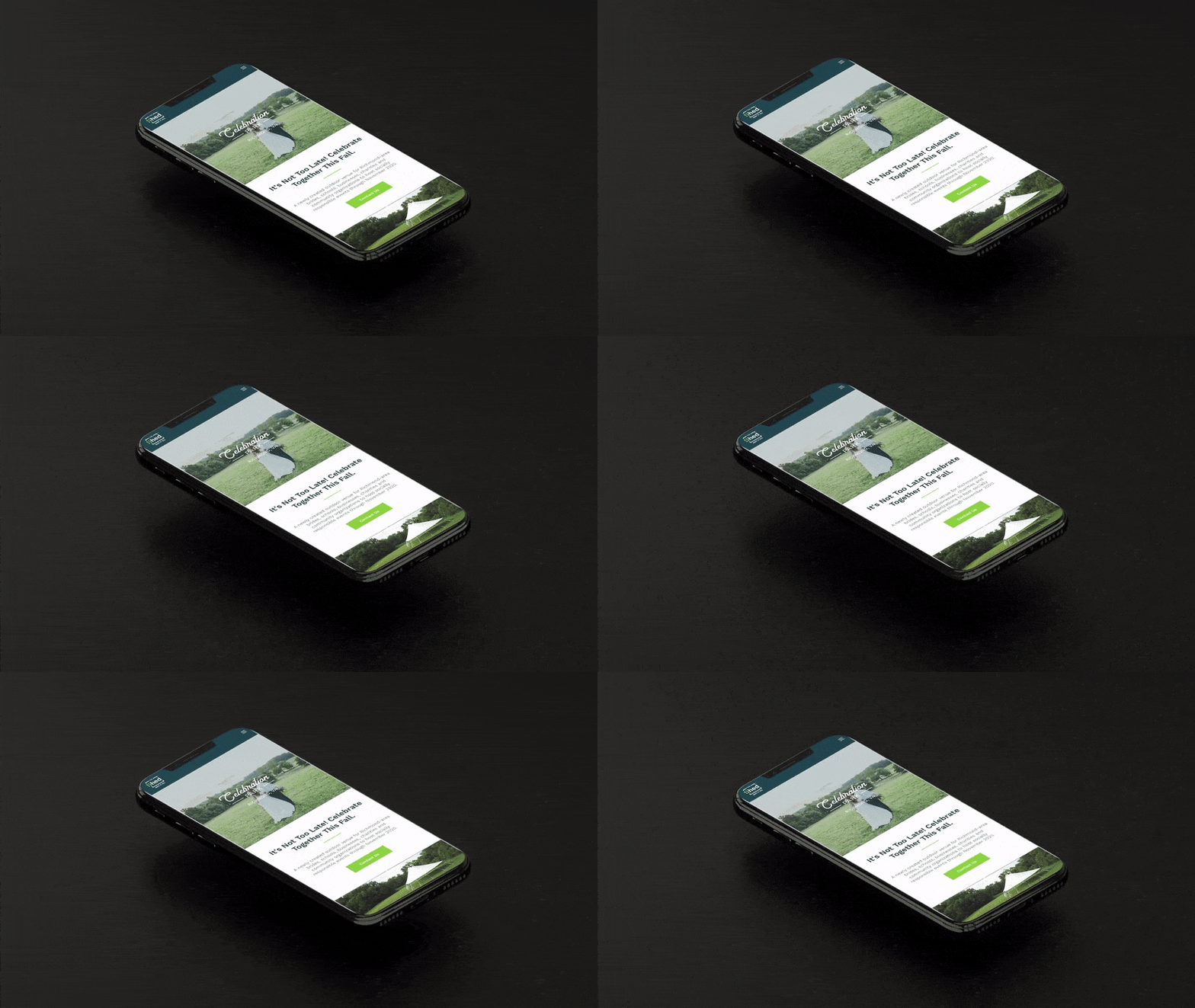
A more “upscale” brand identity that mixes well with The Shed’s main dark blue color scheme (the green took away from the ‘classy’ experience we wanted) along with beautiful imagery came together perfectly. A beautiful mix of The Shed’s traditional font (Work Sans) and an understated script font for “celebration” helps grab the users’ attention, & showcase that Celebration Park is a sophisticated place to book all of your weddings & upscale events through COVID-19 season & beyond.
The UX / UI design showcases the beauty of the landscape, makes it super easy to navigate on screens of any size, and allows folks to easily see what’s included in each package with drop-down menus, and a straightforward contact section at the bottom allows folks to easily reach our for more info… and of course, we needed a flyer/some print media to help get the word out about this beautiful new event space, too!
Services
- UI Strategy
- Web Design
- Wordpress
- Graphic Design
Client(s)
The Shed
Celebration Park
Year
2020

