The mission
In September 2018, Krisztina Thorsen asked for help designing a logo for her budding photography business. She wanted it to “feel” like her and match her beautiful photography style. I started thinking of ways to put together a delicate, feminine logo that highlighted her “golden hour” style that was both professional and a little playful.
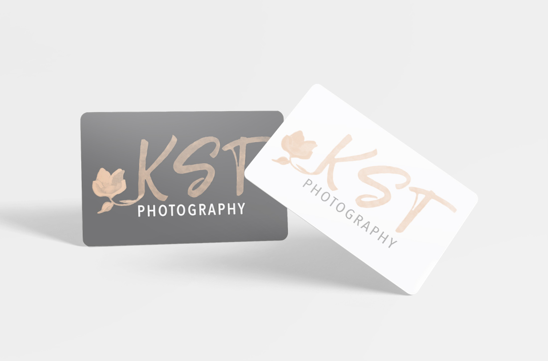
The result
I set out to experiment around with a soft watercolor paint style to add a little more of a feminine feel, and some elements of texture. The finished product is simple: a refreshing, delicate, watercolor inspired monogram mark with a playful peachy-pink color, and even includes a blooming peony (Krisztina’s favorite flower). Professional and playful with an “airy, clean” feel to it.